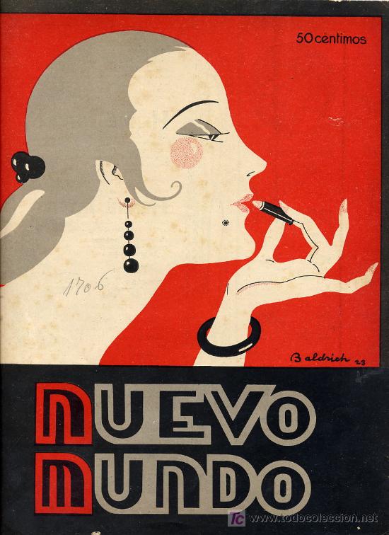
Oooh. Love the lettering. Deco never appears forceful: you can see this in the way the designer has allowed the second ‘O’ to fall short slightly from the one above. Many designers today would try to align them just for the sake of it but really there’s no need. The colours are great too — similar to the red, black and white of orthodox typography. Love this blog


2 comments:
Oooh. Love the lettering. Deco never appears forceful: you can see this in the way the designer has allowed the second ‘O’ to fall short slightly from the one above. Many designers today would try to align them just for the sake of it but really there’s no need. The colours are great too — similar to the red, black and white of orthodox typography. Love this blog
Thanks! :) If you click on the tag "magazine covers" maybe you'll find other examples of cover design you might like.
Post a Comment